If you want to know the true size of the world, don’t look at an atlas.
This may sound like a conspiracy theory but our current world map is wrong. The size and shape of countries and continents are either much bigger or much smaller than you think.
Why is this? It all comes down to maths. The Earth is a sphere, a 3D shape. Maps are flat and 2D. If you try and translate one to the other you will always create alterations trying to make it fit.
It helps to think of the Earth as an orange. If you were to draw the continents on the skin, peel it and lay it flat you will notice that however many ways you try, some part of the map will always become distorted. It is this problem that effects almost every world map that we see, meaning few of us have a realistic idea about the size of our countries.
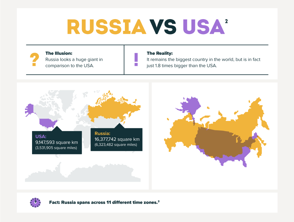
Africa for example, is a lot bigger than we think. Maps suggest that the USA is half the size of Africa, when it’s less than one-third. Germany and Tanzania appear the same size, but Tanzania is in fact over 200,000 square miles bigger. Unless two countries are parallel to one another, one will always be bigger or smaller than we think.

If this is boggling your mind, there is an alternative. The Flat Earth Society hold the belief that we are in fact living on a floating disc – certainly one way to address the world map problem! For those however with a more scientific head, our new infographic will dispel any myths and reveal the true size of our world.