Malak el Tawouk, known for their famous chicken sandwiches, huge sizes, generous filling and mass production, is giving itself a whole new look. Opened in 1996, Malak el Tawouk has fast grown into a popular sandwich joint, operational in 14 branches to date. I spotted a new logo flashing yesterday night. I am curious to know more about it. Has a new company taken over, do they have a new menu now? Would they improve? I personally didn't like the logo... We would love to hear about this if you have more information to share...
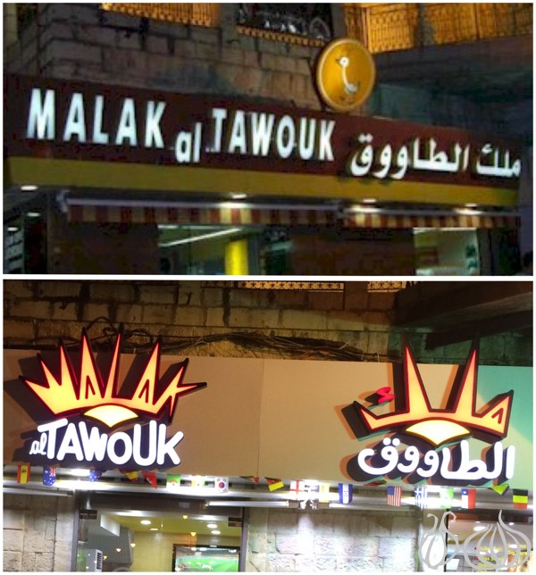
Before: 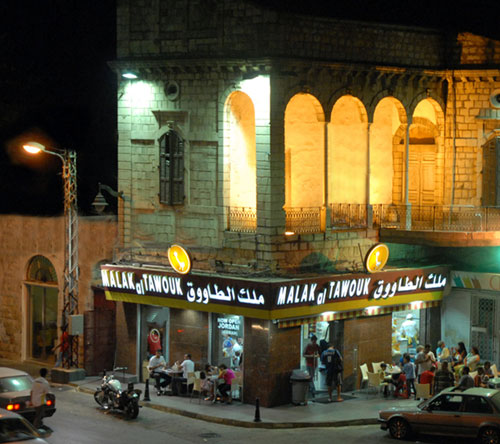
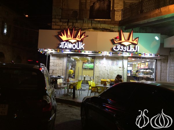
After:
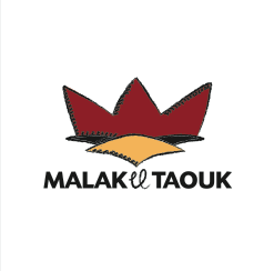
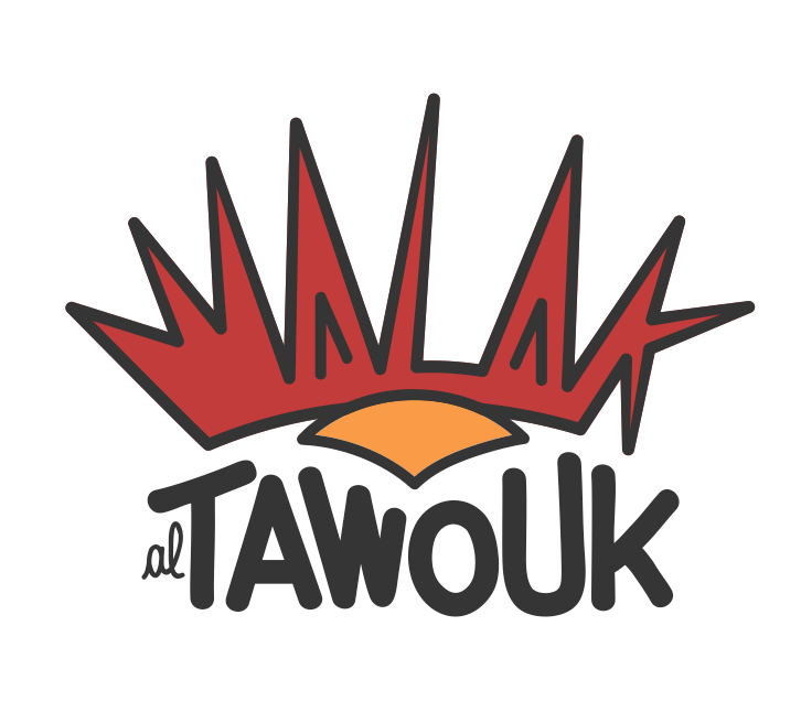
Malak El Tawouk's logo just got a crown
After posting the above questions, NGNO received the answer:
Hi Anthony, Following your enquiry about the Malak al Tawouk (MT) rebranding, here are a couple of helpful infos behind the new look.
MT was established in december 1996 with its first store opening in Jounieh. After proving right, the store ventured into 15 outlets in 14 years. It came to a point, where it couldn't be managed solely by the 2 Saade brothers, and had to function more like a chain, and a franchise, but stay true to their brand and customers, with delivering the happiness and satisfaction they're used to.
After getting ISO certified, it came to a turning point where MT had to be coherent in it's communication, consistent, fresh and of course belonging to this 21st century. For that exercise MT approached the creative duo Tino Karam and Kimmy Zouki, for their expertise in building brands through proven record in ad agencies. Tino is an entrepreneur in the creative communication/entertainment business and Kimmy, a strategic planner at heart, currently residing in NYC, establishing his own creative culinary business.
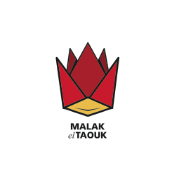
Now back to the Malak. The challenge was a brand shake up and total re-looking with specific visual and business guidelines, with potential expansion into international markets (gulf,europe,usa). As currently some outlets have the original logo, others a new logo done 3 years ago, and now the brand new one launching first it's identity in the City Mall outlet. Idea: If you think customer is king, well Malak al Taouk is home of kings.
We are not pretentious, we are not expensive, we are generous, quirky, fun, honest, fresh and of course tasty. Combining a chicken and a king went through different trial and error, till we fine tuned the whole identity from logo, menu, signage, merchandise, uniforms,... thanks to the great team effort of creatives, Marya Ghazzaoui, Judy Rizk and Cynthia-el Hasbani. And the patience of project manager Neyla Kahwagi and owner Joseph and Alain Saade.
The red, and white background colors, are not to be taken for granted, it just represents the not so secret tasty recipe, of combining ketchup and toum :))
Now you know why the logo just got a crown.