Burger King® has announced the brand is making a leap forward by introducing a completely new visual design that will be present throughout all touchpoints of the guest experience.
Inspired by real and delicious food, the more modern look marks the first complete rebrand in over 20 years and will more authentically represent Burger King® values. Guests in the Middle East will start seeing the new visual identity starting at the beginning of 2021.
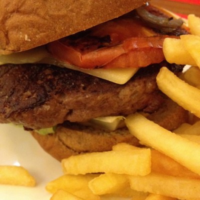
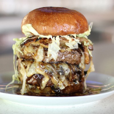
The announcement signals a commitment to digital-first expression and recent improvements to taste and food quality standards, the removal of colors, flavors and preservatives from artificial sources, as well as an ambitious pledge to environmental sustainability.
Today, more than ever, Burger King® strives to ensure guests feel good about its food, and this is reflected throughout the visual design, restaurant design and across the entire digital experience.
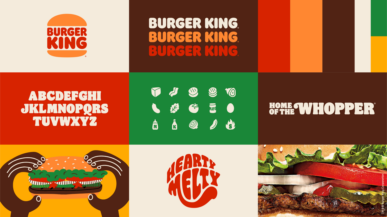
The brand will be rolling out a new brand logo, packaging, restaurant merchandise, menu boards, crew uniforms, restaurant signage and decor, social media and digital and marketing assets. The result is a new look that indicates confidence in the future, while remaining true to the brand heritage and what guests love about Burger King®.
“Every design element was intentionally reimagined to better reflect the new Burger King® food journey,” said Mr Khaled Al Ghamdi VP Olayan Food Division. The new design principles perfectly capture the unique characteristics of the Burger King® brand and we are now looking forward to introducing the new visual identity to our valued guests right across the Middle East.”
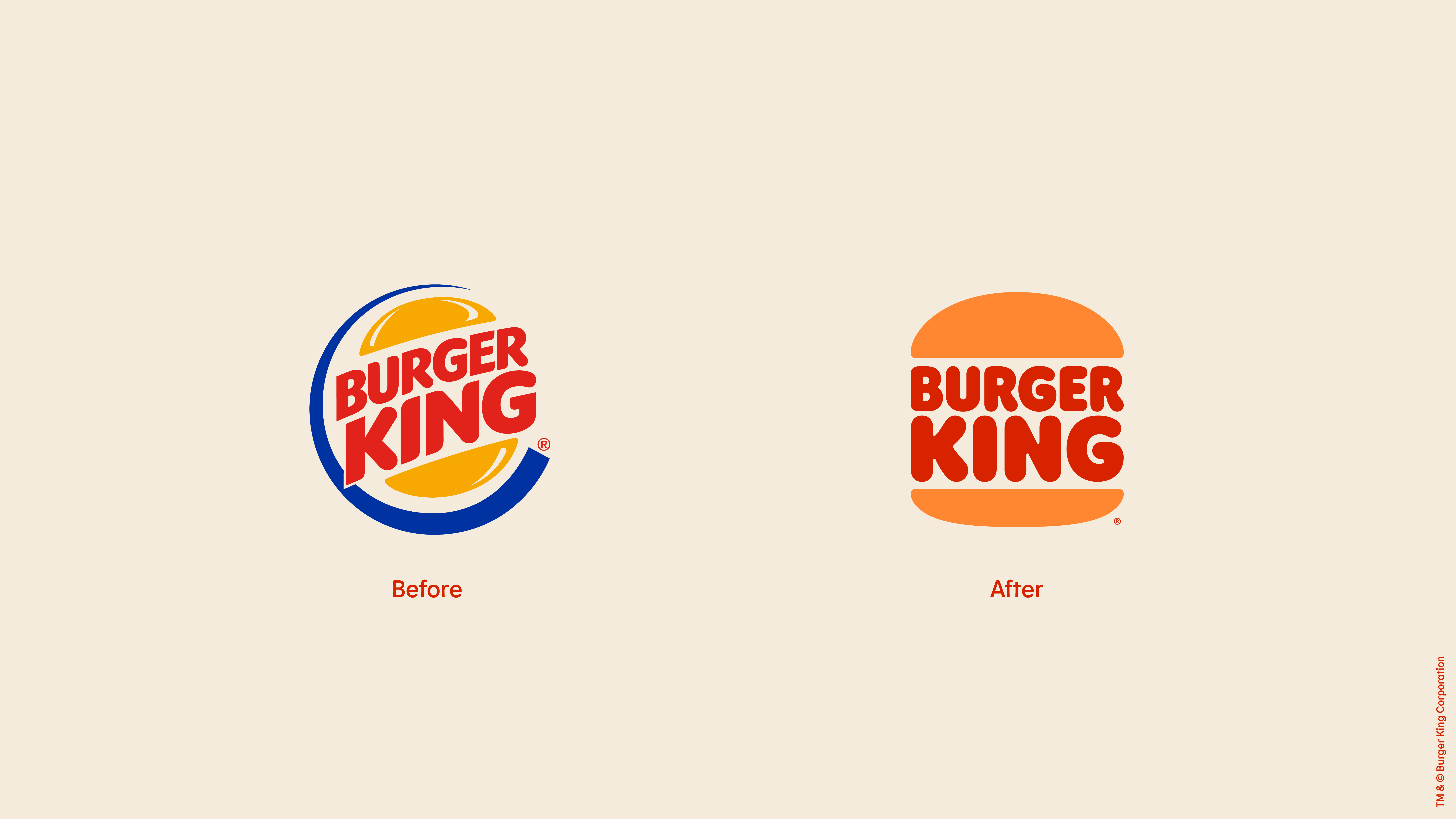
Logo. Boldly, what Burger King® is all about - real, simple and delicious food. Since launching the current logo in 1999, the industry has transitioned to a more modern, digital-friendly design language. The new minimalist logo seamlessly meets the brand evolution of the times and pays homage to the brand heritage with a refined design that's confident, simple and fun.
Color. Selected colors are unapologetically rich and bold, inspired by the iconic Burger King flame grilling process and fresh ingredients. The new photography is hyper-textured and dials up the sensorial aspect of the food.
Font. Burger King® new proprietary brand font is (appropriately) called "Flame". The font is inspired by the shapes of Burger King® food - rounded, bold, yummy – and the brand's irreverent personality.
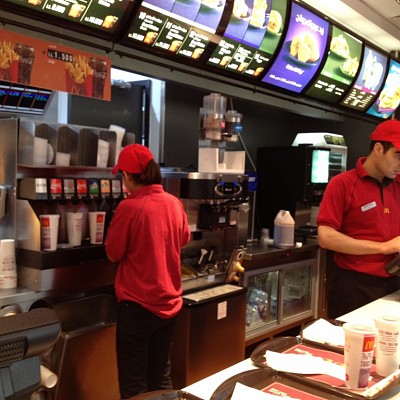
Uniforms. New crew member uniforms reflect flame grill masters, mixing contemporary and comfortable style with distinctive colors and graphics. Real crew members are featured in new Burger King® advertising.
Packaging. New packaging showcases the new logo very proudly as well as bold colors and playful illustrations of ingredients.
"Design is one of the most essential tools we have for communicating who we are and what we value, and it plays a vital role in creating desire for our food and maximizing guests' experience," said Raphael Abreu, Restaurant Brands International Head of Design. "We wanted to use design to get people to crave our food; its flame-grilling perfection and above all, its taste."
Over the next few years, Burger King aims to implement its new design at restaurant locations across the world.