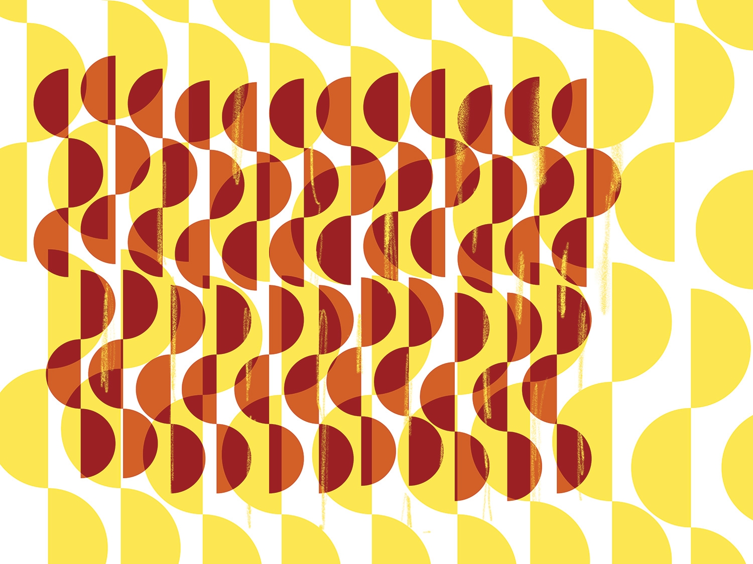
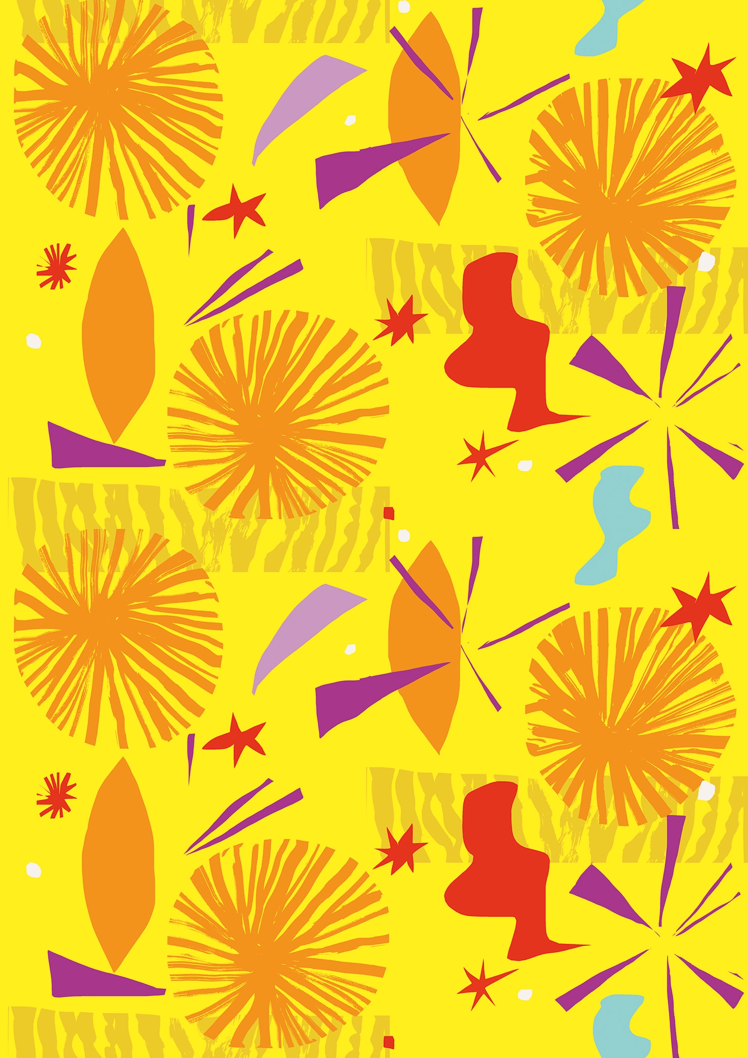
Digital Arts: The designers behind the ice-cream brand’s major refresh tell us how they commissioned ten international artists to create patterns visualizing each Häagen-Dazs flavor.
To do this, a new brand identity has been created, with new packaging designs and new ice cream flavors. Alongside Häagen-Dazs ice cream, now available on sticks and in small pots, (products launched for social media snapping) each flavor of ice cream has a designated artist who redesigned its packaging and associated visuals. Dave says the new packaging replaces detail with a Scandinavian-inspired simplicity.
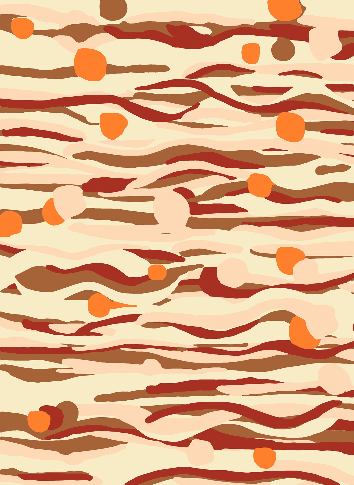
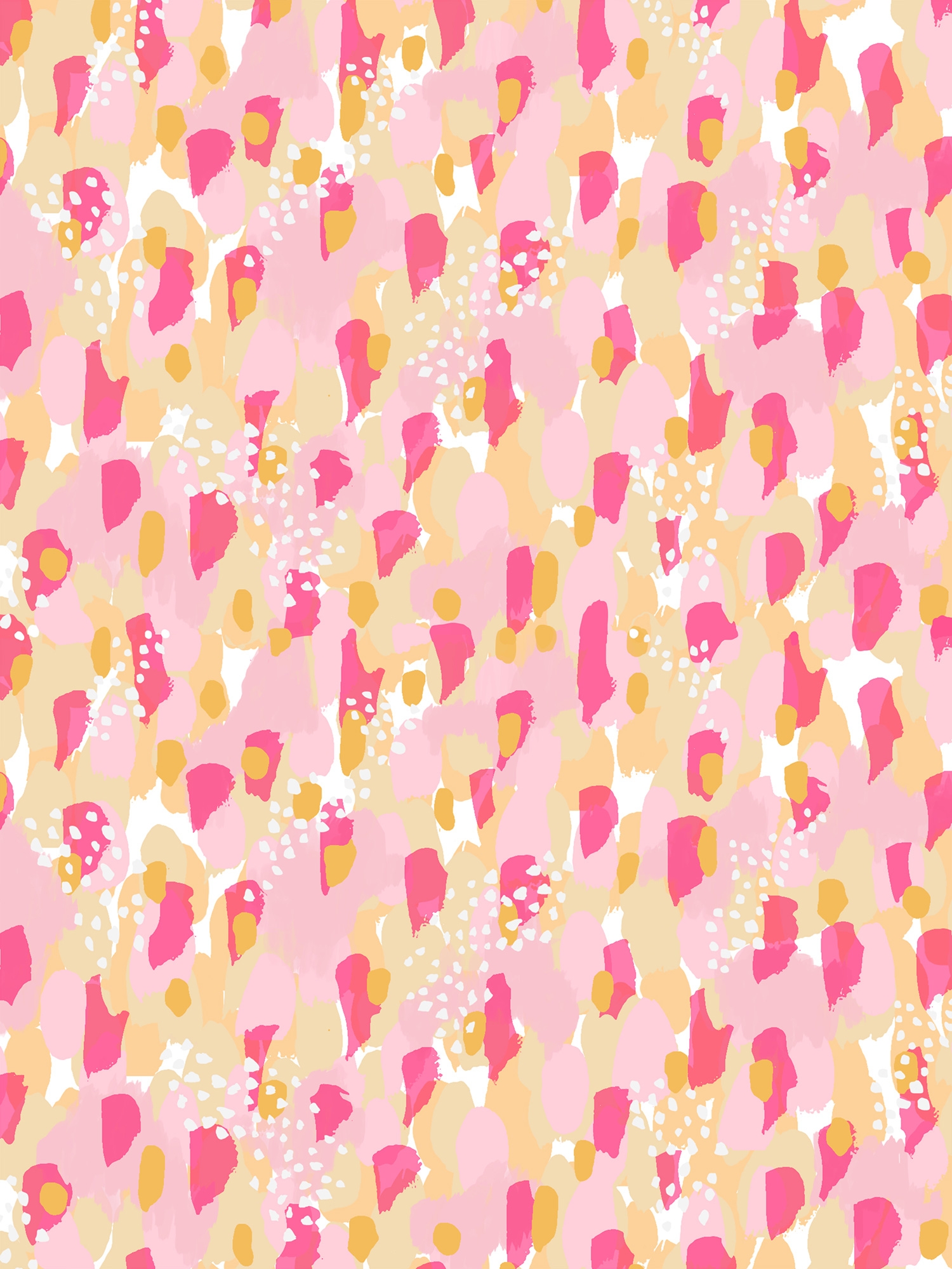
The final illustrations are not only used on packaging but everywhere possible within the new campaign, including online, as wallpaper – it even covered pillows at the event.
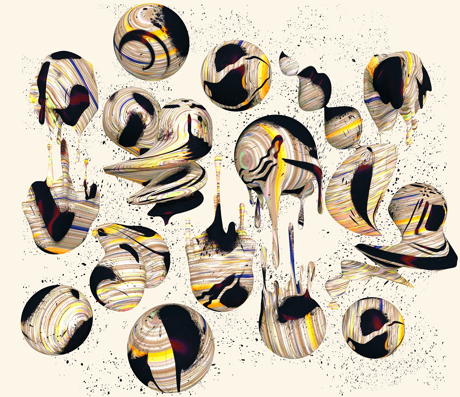
Love chose a mix of international painters, 3D illustrators, graphic illustrators, textile designers, and artists from countries such as Japan, the UK, and US to illustrate and capture the taste of flavors, such as the new strawberry cheesecake. Artists were chosen for their tendency toward patterns and bright, clean and bold colors that would stand out on people's feeds and on the shelf. Names include Cassie Byrnes, Kustaa Saksi, Santtu Mustonen, Ashley Goldberg, Moniquilla, Anna Alanko, Sam Coldy, Marina Esmeraldo and Antti Kalevi.
UK-based Sanderson Bob Studio created bespoke branding, typography, and imagery for designs from Mango & Raspberry, Chocolate Salted Caramel and Macadamia Nut Brittle. (Read more on Digital Arts)